Artwork and media instructions
Artwork | Multimedia |
|---|---|
- | |
- | |
- | |
- |
Interactive data visualization and other online article enrichments
Elsevier allows authors to include interactive data viewers, contextual information, computer code and other online enrichments.
Creating accessible figures for all types of color vision
Color blindness affects 5-10% of the population, mostly males. We recommend that you create figures that are accessible to all, including those with impaired color vision. It’s surprisingly easy if you follow these five simple guidelines:
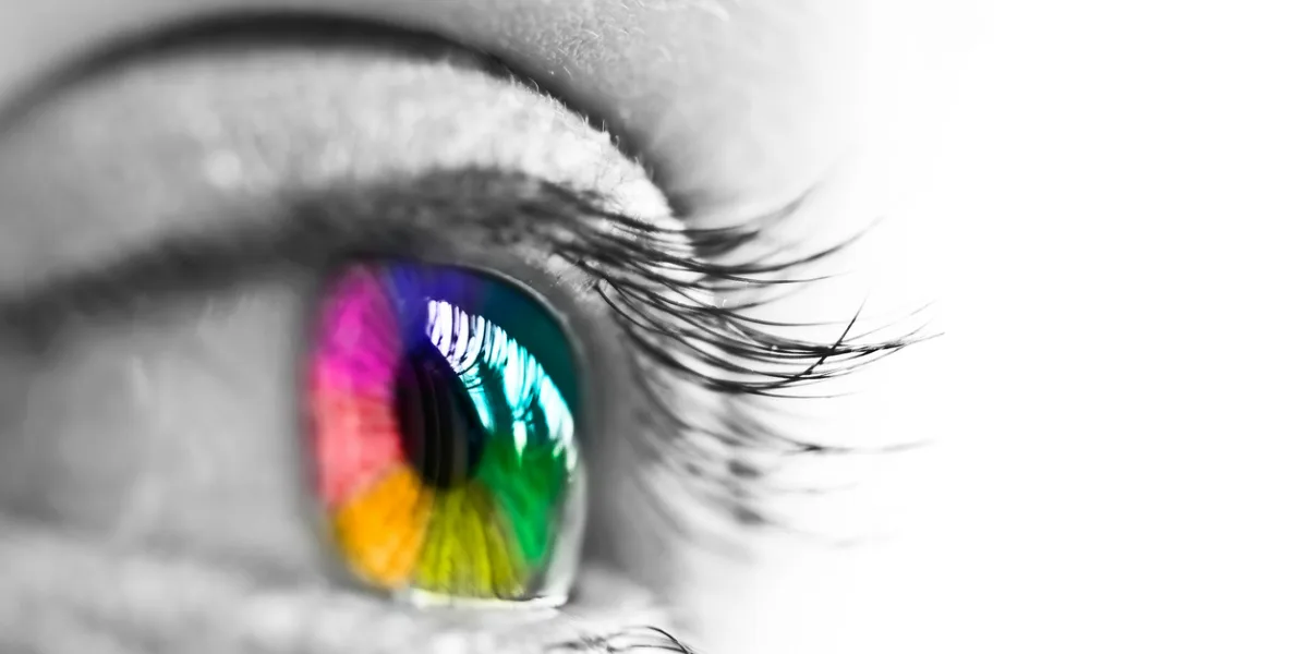
Use a color blind safe palette
Use sufficiently high contrast
In fluorescent red-green images, replace red with magenta
Simulate how your design would look to the color blind eye using one of the many free tools or the “Proof setup” function in Adobe Photoshop
Ask yourself: Do you really need to use color to represent your data? Perhaps you can use monochromatic figures, or different shapes, positions and line types instead
Elsevier's policy on manipulation of images
Our policy is that no specific feature within an image may be enhanced, obscured, moved, removed or introduced. Adjustments of brightness, contrast or color balance are acceptable, if, and as long as, they do not obscure or eliminate any information present in the original.
Manipulating images for improved clarity is accepted, but manipulation for other purposes could be seen as scientific ethical abuse and will be dealt with accordingly.
See: Mike Rossner, Kenneth M. Yamada; What's in a picture? The temptation of image manipulation. J Cell Biol 5 July 2004; 166 (1): 11–15. doi: https://doi.org/10.1083/jcb.200406019opens in new tab/window